Mobility restrictions, from stay-at-home orders to indoor occupancy caps, have been utilized extensively by policymakers during the COVID-19 pandemic. These reductions in mobility help to control the spread of the virus 12, but they come at a heavy cost to businesses and employees.
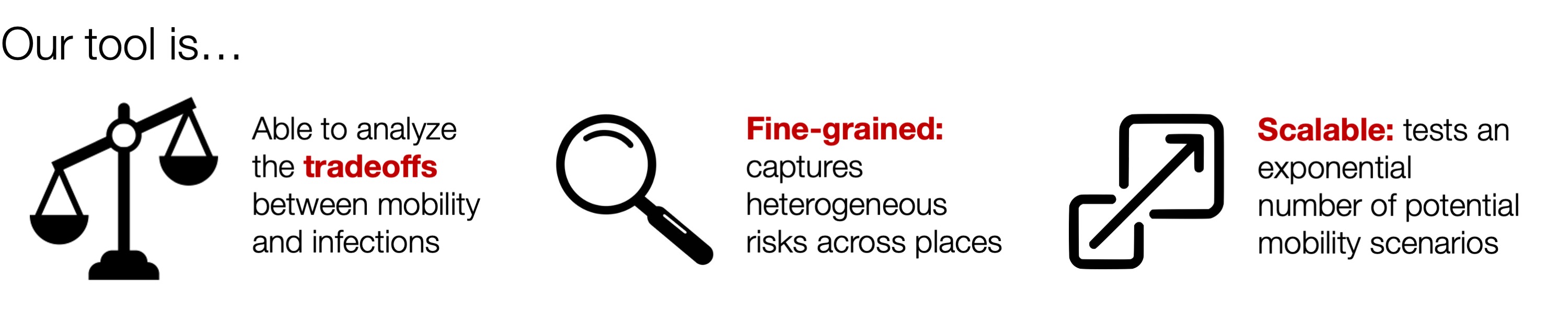
To balance these competing demands, policymakers need analytical tools that can evaluate the tradeoffs between mobility and COVID-19 infections. Furthermore, such tools should be fine-grained, able to test out heterogeneous plans—for example, allowing one level of mobility at essential retail, another level at gyms, and yet another at restaurants—so that policymakers can tailor restrictions to the specific risks and needs of each sector. At the same time, the tool also needs to be scalable, supporting analyses for a massive number of potential policies so that policymakers can find the best option for their jurisdiction.
Our tool
To fulfill these needs, we developed a novel computational tool, which we built in collaboration with the Biocomplexity Institute & Initiative at UVA to support the Virginia Department of Health (VDH). Described in our award-winning KDD 2021 paper, our tool enables policymakers to assess the costs and benefits of thousands of different mobility measures, based on millions of simulations from our underlying epidemiological model. We designed our tool to fulfill VDH’s desire to have a quantitative and comprehensive analysis of a range of reopening policies. With their guidance, we developed an interactive dashboard, where policymakers can select various proposed changes in mobility and observe their predicted impacts on COVID-19 infections over time and across regions.
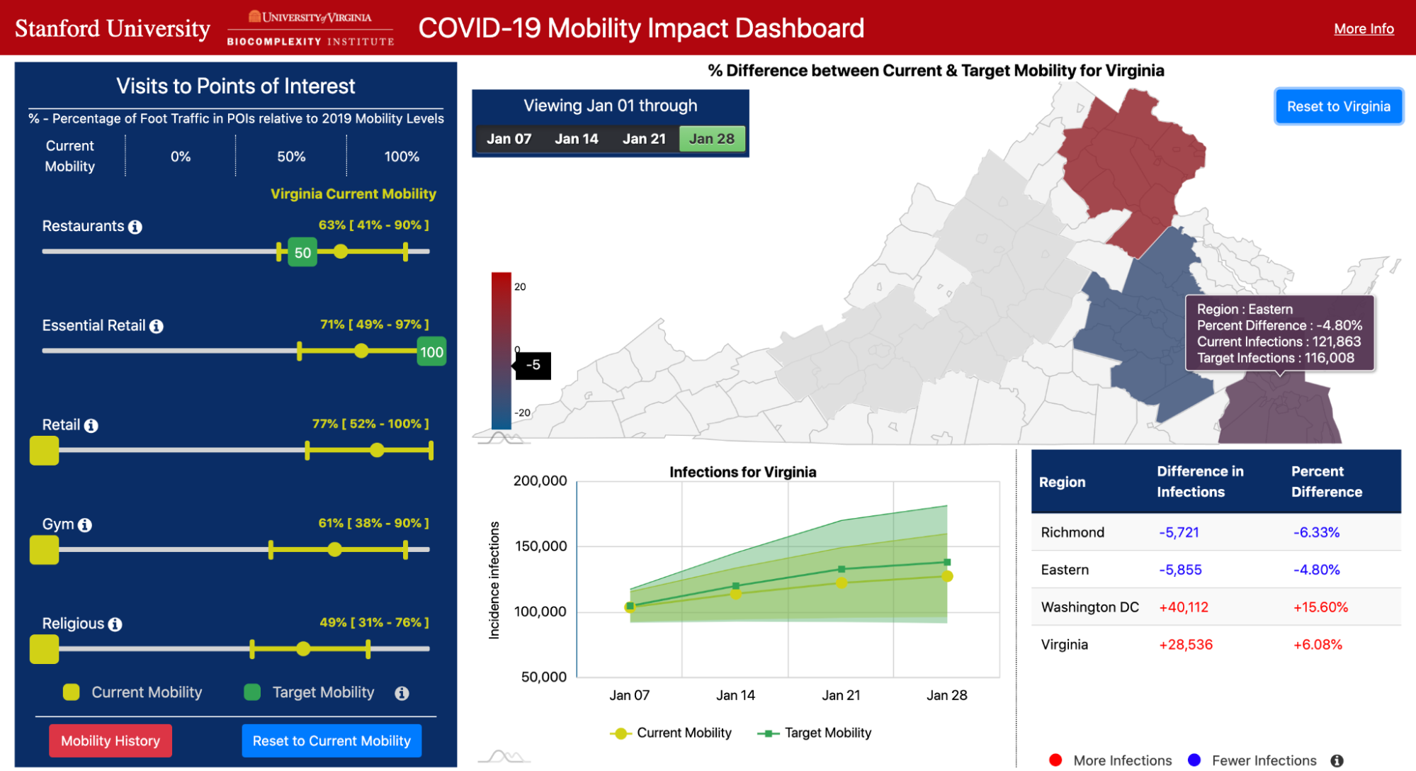
Our dashboard focuses on mobility to five key categories of places: Restaurants, Gyms, Religious Organizations, Essential Retail (grocery stores, pharmacies, convenience stores), and Retail (clothing stores, book stores, hardware stores, etc.). For each category, the user can use sliders to choose a target level of mobility (e.g., 50% of normal levels, based on pre-pandemic mobility), or they can choose to continue current levels of mobility at these places. The other panels on the dashboard then visualize predicted COVID-19 infections under the selected mobility plan, and compare these outcomes to what would happen if all categories remained at their current levels of mobility.
Our tool enables policymakers to comprehensively analyze pandemic tradeoffs, by quantifying visits lost under each mobility plan as well as predicted infections. The sliders for each category allow them to test fine-grained, heterogeneous policies. Furthermore, the flexibility of our approach (i.e., allowing any combination of mobility levels) results in an exponential number of scenarios to test. To scale our modeling efforts, our tool features a robust computational infrastructure that compresses 2 years of compute time into the span of a few days.
Our approach
At the heart of our tool is our state-of-the-art epidemiological model which utilizes large-scale mobility networks to accurately capture the spread of COVID-19 in cities across the US.
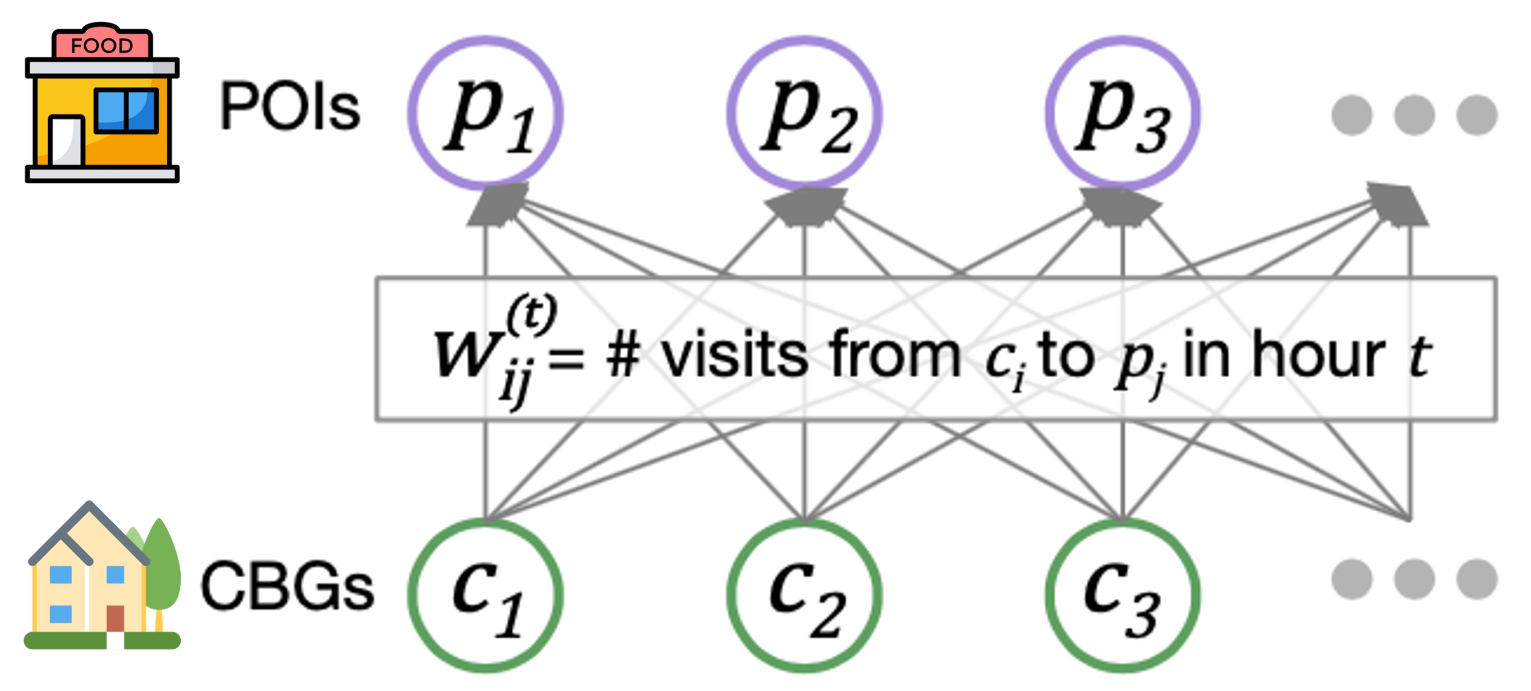
Our mobility networks encode the hourly movements of people from census block groups (CBGs) to points of interest (POIs), which are non-residential locations such as restaurants, grocery stores, and churches. Using iterative proportional fitting, we infer these networks from aggregated, anonymized location data provided by SafeGraph. In this work, we infer hourly networks for the Washington DC, Virginia Beach, and Richmond metropolitan areas, three of the largest metropolitan areas in Virginia. From November 1 to December 31, 2020, their resulting networks contain 3.4 billion hourly edges between CBGs and POIs.
We integrate the mobility networks, along with other data sources such as daily mask use, into our model. The key to our model is that it maintains the number of people in each CBG who are susceptible (S), exposed (E), infectious (I), or removed (R).

These CBG states are updated in each hour of the simulation, based on transmission dynamics that capture both household transmission and transmission occurring at POIs. That is, if there are susceptible and infectious individuals visiting a POI at the same time, then we model some probability of new infection occurring. That probability depends on the POI’s area in square feet, its median dwell time, the percentage of people wearing masks, and the number of susceptible and infectious visitors. Based on all of these factors, our model realistically captures who was infected where and when, down to the individual POI and hour.
To validate our models, we compare its predictions against actual daily COVID-19 cases and deaths, as reported by The New York Times. In our initial work 3, published in Nature 2020, we showed that our dynamic mobility networks enable even these relatively simple SEIR models with minimal free parameters to accurately fit real case trajectories and predict case counts in held-out time periods, despite substantial changes in population behavior during the pandemic. Integrating these networks furthermore allows us to capture the fine-grained spread of the virus, enabling analyses of the riskiest venues to reopen and the most at-risk populations.
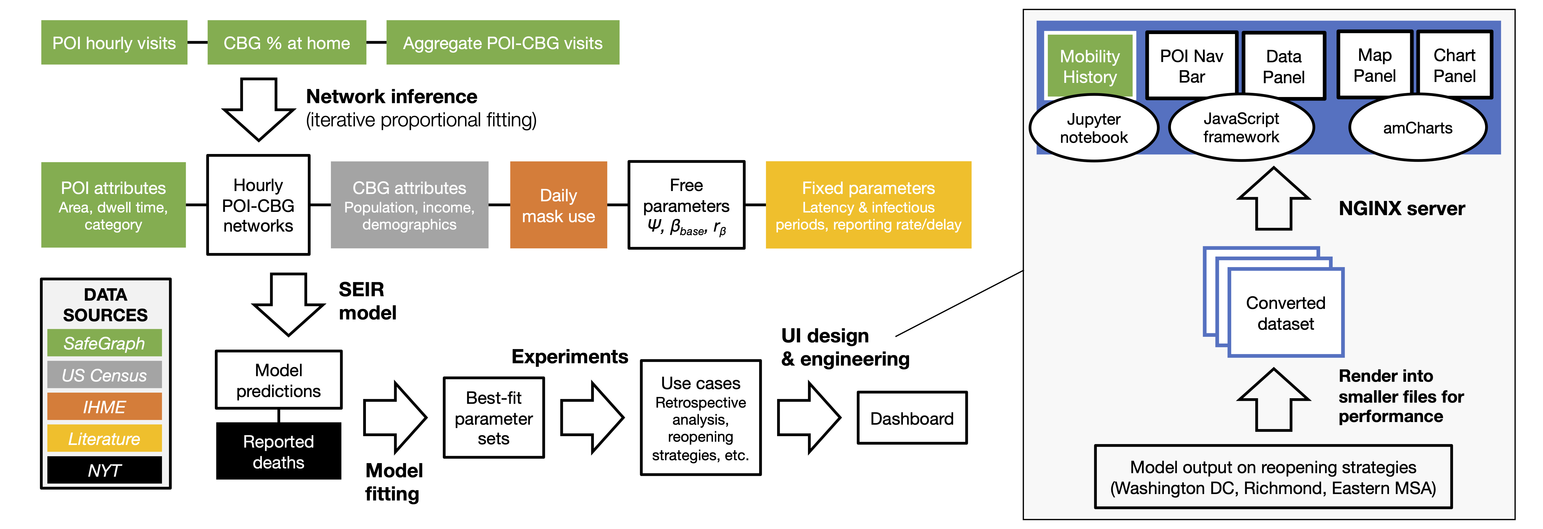
In this work, we sought to translate our model into a tool that can directly support COVID-19 decision-makers, motivated by our interactions with the Virginia Department of Health. This goal required many extensions to our computational pipeline, including fitting the model to new regions and time periods, and improving our computational infrastructure to deploy the model at scale. Furthermore, to keep pace with developments in the pandemic, we introduced new real-world features to the model such as daily mask use, time-varying case and death detection rates, and model initialization based on historical reported cases/deaths. These additions allowed us to accurately fit real COVID-19 trajectories in Virginia, and we showed that the inclusion of our new features contributed substantially toward reducing model loss. Most importantly, we worked with VDH to design use cases of our model that were most relevant to their needs, and developed a new dashboard to effectively communicate thousands of results from our model. Our full pipeline—the extended model, the computational infrastructure, and the new dashboard—constitutes advancements in this work that allowed us to truly transform our scientific model into a tool for real-world impact.
Using our model
Our fitted model can be applied to a wide variety of use cases. First, we can use it for retrospective analyses, by leveraging the model’s ability to capture who got infected where and when.
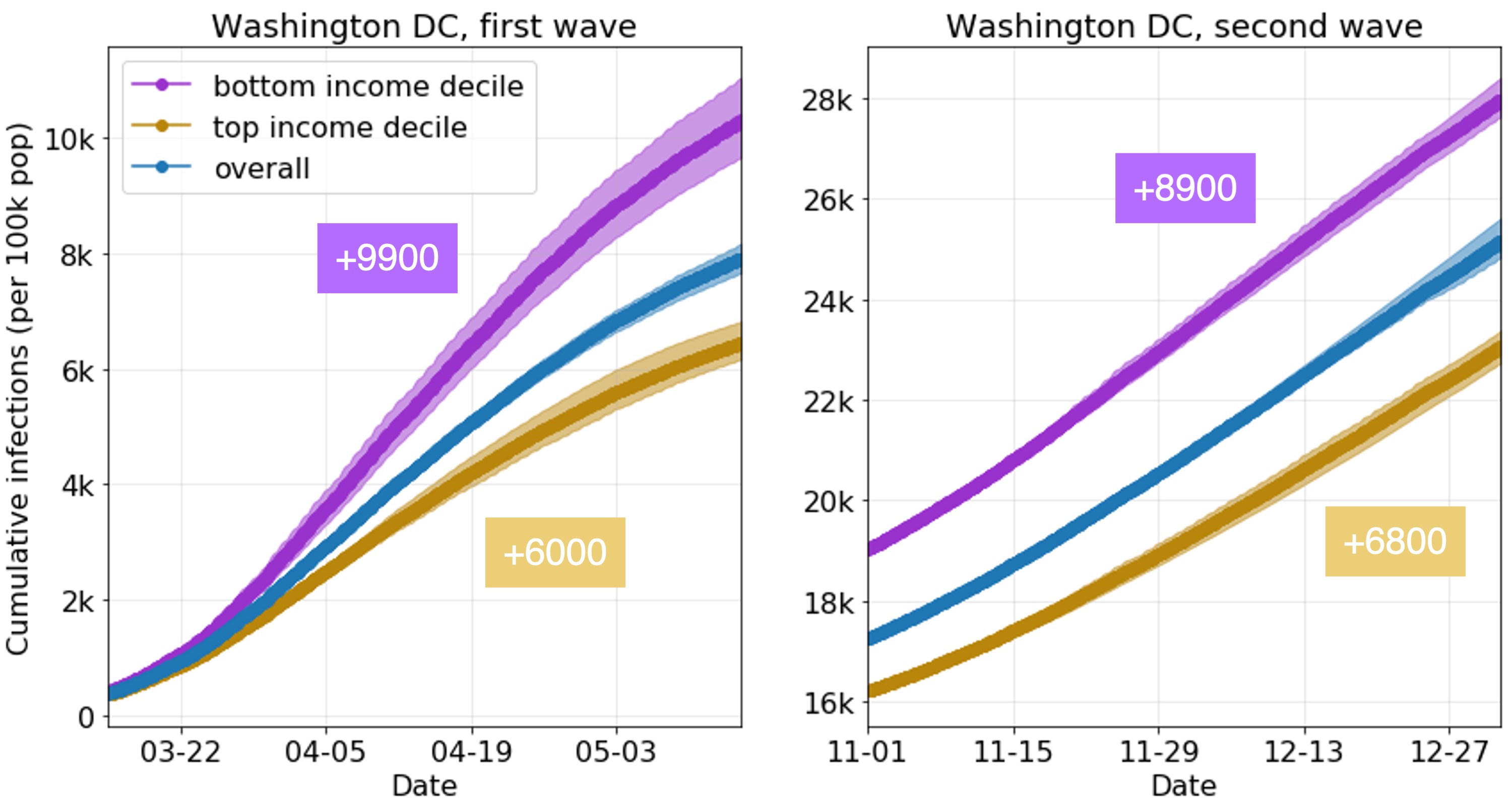
For example, we can use the model to compare the learned infection rates of lower-income and higher-income CBGs. What’s striking is that our model correctly predicts disparities from mobility data alone, even though we did not give our model any CBG demographics during runtime (only during analysis). In our prior work, we showed that two mechanisms in the mobility data explained these predicted disparities: lower-income CBGs were not able to reduce their mobility as much during the pandemic, and the POIs that they go to (even in the same category) tend to be more crowded with longer visits, and thus riskier. In this work, we show that this trend extends to both waves of the pandemic and to new metropolitan areas.
We can also use the model for forward-facing experiments. Essentially, the model has many different interpretable inputs, so we can simply modify one of those inputs, run the model, and observe what happens to the model’s predicted infections. For example, to generate data for our dashboard, we modify the mobility networks to reflect the user’s selected levels of mobility for each category, and run the model forward to produce predicted infections. We can also use our model to analyze vaccination strategies; for example, by reducing transmission rates per CBG based on the percentage of the CBG that is vaccinated.
Discussion & next steps
Our approach is not without its limitations, which we have discussed with policymakers. For instance, the mobility data from SafeGraph does not cover all POIs (e.g., limited coverage of nursing homes) or populations (e.g., children), and our model makes necessary but simplifying assumptions about the dynamics of disease transmission. Furthermore, in this work, we focused on how changes in mobility impact transmission, but where do these changes in mobility come from and how can we effect them? In future work, we plan to develop new models to answer these questions, to analyze and predict how complex mobility networks change in response to policy interventions and other pandemic events.
That said, in this work we’ve addressed a significant part of the puzzle, by introducing a tool that provides a quantitative and comprehensive near real-time assessment of the effects of mobility on transmission. Our underlying model is furthermore capable of many more types of analyses, from informing inequities to evaluating future vaccination strategies. In fact, we are now supporting the Virginia Department of Health on their vaccination efforts and extending our model to evaluate different vaccination policies. As the pandemic evolves, we will continue building decision-support tools and advancing the capabilities of our model, so that we can best support the needs of policymakers.
Acknowledgements
Special thanks to the SAIL blog editors, Emma Pierson, and Pang Wei Koh for their helpful feedback on this post. This blog post is based on our paper in KDD 2021:
Supporting COVID-19 policy response with large-scale mobility-based modeling. Serina Chang, Mandy L. Wilson, Bryan Lewis, Zakaria Mehrab, Komal K. Dudakiya, Emma Pierson, Pang Wei Koh, Jaline Gerardin, Beth Redbird, David Grusky, Madhav Marathe, and Jure Leskovec. KDD 2021 (Applied Data Science Track, Best Paper Award).
-
S. Gao, J. Rao, Y. Kang, et al. Association of mobile phone location data indications of travel and stay-at-home mandates with COVID-19 infection rates in the US. JAMA Netw Open (2020). ↩
-
J. Oh, HY. Lee, Q. Khuong, et al. Mobility restrictions were associated with reductions in COVID-19 incidence early in the pandemic: evidence from a real-time evaluation in 34 countries. Sci Rep 11, 13717 (2021). ↩
-
S. Chang, E. Pierson, P.W. Koh, et al. Mobility network models of COVID-19 explain inequities and inform reopening. Nature 589, 82–87 (2020). ↩